Learning to Do Historical Research: A Primer
How We Built This Website
William Cronon
Introduction
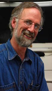
William Cronon
(Photo by Rees Candee)
Over the past several years, I've become increasingly concerned by what has seemed to me to be the decline in the research skills of students in my large undergraduate lecture course in American Environmental History (History/Geography/Environmental Studies 460).
During the fall of 2007, my teaching assistants and I finally concluded that the problem was no longer that students were gradually losing their ability to navigate libraries effectively; much more worryingly, many of them had never really been in a research library and felt quite lost when given an assignment that required them to use such a collection.
Perhaps more surprisingly, many students were not especially skilled at using search engines like Google, let alone the commercial databases of the gated Web, so that even on-line resources were less accessible to them than one might expect.
I therefore decided to embark on a wholesale revision not just of my undergraduate lecture course, but of my graduate seminar as well. In the lecture course, I decided that my longstanding "place paper" assignment (described here) should be accompanied by a more serious effort to teach basic research skills. One result was a new lecture designed to encourage students to explore the treasures that can be found in world-class libraries like those of the University of Wisconsin-Madison and the Wisconsin Historical Society.
But the much more important change occurred in my graduate environmental history seminar. For the past decade or more, I've focused the writing assignments in that course on the challenge of "writing beyond the academy": learning to communicate in ways that make academic knowledge more accessible to the larger public. Hoping that students in the seminar would be as interested as I am in grappling with the challenge of teaching research skills to undergrads and others wanting to learn the craft of history, I completely transformed the syllabus to focus instead on teaching basic historical research skills—and using the Web to do so. To see the Fall 2008 version of this seminar, click here for the redesigned syllabus: 
The most important result is the website you are now visiting, which represents an enormous labor of love by myself and the fifteen students who took History/Geography 932 in the fall semester of 2008.
Table of Contents
Overviewing the Research Process
Emma Schroeder & Abigal Popp
(Photo by Kevin Gibbons)
Although I and a few of the students had some prior experience with web design, none of us had either taken or taught a class that revolved around the production of a large website like this one. We were therefore feeling our way forward for the entire semester, making it up as we went along.
To get students started thinking about basic research skills that needed to be described on the site, I assigned two books during the first month of the seminar to provide broad overviews of the research process and of library search skills:
Wayne C. Booth, Gregory G. Colomb, and Joseph M. Williams, The Craft of Research, 3rd ed., Chicago: University of Chicago Press, 2008.
Thomas Mann, The Oxford Guide to Library Research, 3rd ed., New York: Oxford University Press, 2008.
Although I initially feared when ordering and assigning these books that students would find them less pleasurable to read than the environmental history monographs that comprised the rest of the syllabus, I was surprised and pleased by how enthusiastically they responded to them. They especially praised Booth's classic Craft of Research as a superb overview of the research process, and several expressed regret that they were only reading it now in graduate school. Some said that if they had read the book in the first year of college, it would have transformed their undergraduate experience.
These two readings were due on the day that we invited a panel of librarians to the seminar to seek their suggestions about the kinds of research and library skills we should try to include on our website. We were joined by Ken Frazier and Sarah McDaniel from the UW-Madison library system, and Rick Pifer and Michael Edmonds from the Wisconsin Historical Society Library and Archives. They shared with us their own experience teaching students how to navigate research collections, and offered wise counsel of many kinds about what we should (and should not) try to accomplish on this website. Although we certainly weren't successful in incorporating all of their suggestions into these webpages, all pages are much improved for the help they gave us, and we are very grateful to them for the assistance they provided along the way.
Return to Top of Page
Getting Started with Writing for the Web
Po-Yi Hung and Jesse Gant
(Photo by Kevin Gibbons)
Because most students in the class had not produced content for the Web before, and because we needed practice working together on such a complicated project, we began with an exercise designed to generate a single webpage to which all members of the seminar could contribute.
One of the traditions of History/Geography 932 is a field trip in late September or early October visiting various locations in Dane, Sauk, and Columbia counties within a fifty-mile radius of Madison. Our fall 2008 field trip was on September 20, and we spent time both before and during the excursion talking about ways we might build a webpage on "how to read a landscape." Then, when the field trip was over, students were asked to share half a dozen "tips" for any aspect of "reading the landscape" that had either been especially interesting to them during the field trip, or that reflected their own background knowledge or reading.
Fifteen students each contributing six paragraphs gave us ninety items to pour into what instantly became a very large page of tips for reading landscapes. I circulated these as a single file that was sent to seminar members a couple of days before we met to discuss them, and we then used the document to explore two basic challenges we would be confronting this semester.
The first had to do with the ways the tips were written and how effective they would be if mounted on a webpage. This taught us a lot about prose that does (and does not) work on the Web, and gave us raw material for what would eventually become a style sheet for the larger website.
The second had to do with building a taxonomy into which the very eclectic tips might be gathered in something resembling an orderly structure. This taught us something about organizing the content of webpages, and thinking about how to provide navigational tools for pages on the site.
Based on our discussion, we gave everyone in the group a couple of weeks to revise their tips and submit them. I then collated these into a sample page with photographs to illustrate various points. This gave us all a sense of what the eventual website might look like, though we knew that the researching history webpages would be far more linear and narrative in form than the scattered tips on the Landscapes page.
Return to Top of Page
Creating the Site Architecture and Webpage Teams
Michelle Niemann & Cathy DeShano
(Photo by Kevin Gibbons)
After reviewing and discussing research processes with our panel of librarians, and then producing a sample webpage together to get a sense of what it might look like, we turned to brainstorming the architecture of the overall website.
After an extended discussion, we decided to divide the site into two groups of pages.
One, on the research process, would address the following topics:
The second set of pages would address several key categories of sources:
Once we had agreed on these pages, seminar members volunteered to be responsible for serving on teams of 2-3 students, with each student participating in the construction of one "process page" and one "source page." Two sets of teams volunteered for the daunting task of being the first to present drafts for discussion by the full seminar after just two or three weeks of work, and I drew up a schedule of drafts and presentations for the rest of semester, with the goal of completing and discussing all rough drafts by Thanksgiving.
We had a preliminary conversation about the style in which teams would draft these pages, on the understanding that we would refine our understanding of our collective voice and the general architecture of individual pages after reading and discussing the initial drafts.
Return to Top of Page
Drafting, Discussing, Editing, and Templating Pages
Brian Hamilton
(Photo by Kevin Gibbons)
For almost the next two months, each of our three-hour seminar meetings followed a similar pattern. We devoted half of each class to discussing that week's environmental history readings in what amounted to a fairly straightforward graduate readings seminar (albeit with a strong emphasis on research methods, given what we were doing with the rest of our time). Then, for the other half of each class, we discussed two draft webpages, one relating to process, the other to sources.
Again, you can view the syllabus here: 
The first two of these webpage discussions were especially valuable because they helped us identify various stylistic and structural issues that had implications not just for these initial pages, but all other pages on the site as well. Teams circulated their drafts two days before the seminar met, and we all agreed to read and mark up these drafts to help with the next round of revisions that each team would be doing before finalizing their page.
But especially during those first two webpage discussions, we also sought to identify general questions that would guide all other teams in drafting their pages. How long should each page typically be? Should it be written in first, second, or third person? What kinds of illustrations and examples should teams seek to develop to make their pages inviting and enjoyable? And so on and on.
After two of these conversations, I collated the notes from our discussions to produce a style sheet for the entire site. I then submitted this to the teams, and after additional discussions we wound up revising the style sheet multiple times as the semester wore on. To see what the style sheet looked like by the end of the entire process, you can view it here.
Relatively late in the drafting process, seminar member Kevin Gibbons made the very helpful suggestion that he could create a Word template that teams could use to make sure that their pages followed uniform conventions for coding their section heads and other basic formatting rules. I worked with my web designer Melanie McCalmont to make sure that Kevin's template would translate well when I moved revised Word files over into Dreamweaver, and we refined Kevin's template several times before the end of the semester. It can be viewed here.
There were numerous problems that neither the students nor I were experienced enough to anticipate, with the result that some things did not get standardized until quite late in the process, and some never were—creating a good deal more work for me as webmaster than would have been the case had I been smart enough to impose a template on them earlier in the semester.
Return to Top of Page
The Special Challenge of Illustrations
Brien Barrett
(Photo by Kevin Gibbons)
Photographs proved to be a special challenge. I was clear from the beginning that we must not include copyrighted images on our pages, and encouraged students to draw their illustrations from pre-1923 sources in the public domain or from governmental sites. We also had permission within the university to make use of certain collections without having to worry about copyright permission fees. This was very helpful, but didn't solve all the photographic challenges we would ultimately face.
Once we had seen a few draft pages, we realized that despite the value of brevity when writing for the Web, our teams had way too much ground to cover to fit their content onto pages that were a few screens long. We decided that this was OK even though we knew that some visitors to the site would be unwilling to work their way through the very long pages we ultimately created.
But once we had accepted the fact that our pages would be quite long, we knew that we at least needed to break them up with lots of sections, lots of white space, and—especially—lots of images. This was relatively easy for many of the source pages, which were able to include visual examples of the documents they discussed, but it proved much harder for the process pages.
For these, teams came up with a number of creative devices for adding images to what would otherwise have been many screens of straight prose—lethal on the Web for the kinds of student audiences we were hoping to reach. So team members got out their digital cameras and took photos of the processes they were narrating, often with tongue in cheek while doing so. Some of our process pages wound up being much more playful and fun in their final form than we would have imagined possible when reading the rough drafts.
But our proliferating collection of photographs created still more challenges. Most seminar members were not skilled users of Photoshop or other digital image processing software, with the result that JPG files came to me as webmaster in all shapes and sizes. We eventually imposed naming conventions on the photo files, but late enough that the images on the site aren't named in an especially consistent way. Worse, we didn't understand until very late in the process what the default image sizes and resolutions should be, so that I wound up Photoshopping most of the images all over again in the process of loading them. When next I embark on this kind of a venture, I'll have a much better idea of how to impose greater structure and consistency on this part of the process. (Again, I've gathered some suggestions about this toward the end of.the final version of our style sheet.)
Return to Top of Page
Beta Phase
Genya Erling
(Photo by Kevin Gibbons)
By Thanksgiving, the drafts of all teams had been shared with the seminar, discussed, and critiqued. Because some teams wrote their drafts much earlier in the semester than others, we staggered the delivery of final versions of each page, but all were essentially complete by the last week of the semester in mid-December.
We devoted our final two seminar discussions to various technical endgame matters, including a discussion in which members of the class reflected on the overall process. The students agreed to let me revise individual pages as needed to keep them current, but we all agreed that it would be a shame to close down the site simply to let another group of students repeat the same experience—an interesting consequence of a pedagogical strategy in which an entire class generates a publishable product together. I told them that, rather than repeat this enterprise anytime in the near future, I thought it made much more sense to produce additional pages for the site we had created together, or create parallel sites on similar topics that might usefully be addressed via this medium and this process.
Although students offered to help in whatever ways they could, the loading of pages ultimately fell on my shoulders, and I still don't see any easy way to avoid this, given the importance of maintaining consistency, avoiding conflicts among different people loading files, and so on.
In theory, a teacher leading a class like this one could poll students at the start of the semester to identify those with special technical skills with HTML-coding and digital photography (to name just the two most obvious needs), but this might or might not yield a site of professional quality. Furthermore, this strategy would create quite different classroom experiences for students assigned special technical tasks compared with those doing work more focused on the intellectual content of the course.
In the end, I think it's probably better for the professor in charge (or a special assistant who is not taking the course for credit) to handle the technical programming of a site like this one, though I suppose this may change if coding skills become more common among students in the future. Because the end of our production process thus funneled through me and my computer, it took a couple of weeks both to load the final pages and to put finishing touches on various elements of the site, but by the end of December, I was ready to declare the site to be in beta phase.
Although the semester was over and grades had been turned in, seminar members had already agreed that each would read every page on the site and forward to the original teams any errors or revisions they identified. This process continued through mid-January, whereupon each team had a couple of days to collate all the revisions and forward them to me.
Even the process of submitting edits was a learning process, since some of the formats used by individual teams proved easier for the webmaster to apply—another learning experience that has led me to revise our class style sheet so as to simplify this final revision process when it occurs in the future.
There remain some technical tasks ahead to integrate this site more gracefully into www.williamcronon.net, since the original text menus we used during the composition process are clearly less elegant than they should be when they appear doubled up beneath the menus for the site as a whole. But I decided not to delay the release of the site while I figure out how best to make those changes. They can be integrated later on without changing any of the URL addresses under which the site will permanently reside.
My last task was to draft this history of the website to record what we did in case others might find our experiences useful as a model.
Return to Top of Page
Lessons Learned
Brien Barrett, Stillman Wagstaff, Liese Dart, Stephen Laubach
(Photo by Kevin Gibbons)
Would I do this again? Absolutely.
I'm sure the students would agree with me that constructing this site was more work than we imagined when we embarked on it; since the task of serving as webmaster fell to me, it also represented a big additional workload for me.
But the rewards have been enormous.
I've become more and more uneasy in recent years about the traditional model of graduate education in which faculty mentors like myself teach the craft of history (in my case, to students in many different disciplines) by training them how to write books, journal articles, and (again in my case) various kinds of prose for non-academic audiences. Although we all use the Web and all recognize that more and more of our own reading and that of our students is occurring on-line, very few of us have taken up the challenge of teaching students how to write and generate content for this new medium that has become so central to all of our lives.
Although no member of our seminar would claim that this is the perfect website, we're all proud of what we managed to accomplish together in the space of a single semester. Even though I served as webmaster and didn't try to teach students how to use Dreamweaver, Photoshop, or other basic tools of web design, seminar members certainly came away with a more detailed sense than most of them had ever had before of what is required to produce quality web content . (When I teach a seminar this way in the future, it's now clear to me that I should include at least a basic workshop on using Dreamweaver to generate code in HTML, XHTML, and CSS.)
There were other advantages. Although our stated goal was to build a website that would teach undergraduates and other relative beginners how to do historical research, in fact everyone in the seminar (myself included) learned a great deal about research techniques ourselves. Our discussion of class readings (which consisted of the full book-per-week load that is typical of history seminars) was significantly enhanced by our tendency to spend time analyzing the research methods and choices that individual authors had chosen in doing their own work. Unsurprisingly, some of the monographs we read have wound up supplying illustrations on the pages of this website, which has enhanced our seminar's experience of both.
Perhaps the most remarkable benefit we all derived from this project was the extraordinary sense of common purpose and community that the shared work created for us. History seminars generally have a major paper as their final project, with the result that students become more and more focused on their individual work as the semester goes on. Not so for this group. If anything, we all became more and more involved in each other's labors as the project grew and flourished before our eyes. Despite the workload, the students were unfailing in their good humor, and their sense of camaradarie was quite wonderful to experience.
If I were to distill the lessons of this experience into a few suggestions to others thinking about designing courses around similar projects, I might offer the following tips:
- If you've got the technical skills to do something like this, I'd encourage you to try it. I've never had a class like it. But both you and the students need to be prepared to commit yourselves to a lot of work and a high standard of professionalism if you're all to be proud of what you create together.
- One of the chief benefits of a project like this one is that, unlike most classroom exercises, it feels real. This is because it is real: it constitutes a genuine publication for students and teacher alike, and should be of real practical value to others wishing to learn more about the craft of history. Not many ordinary seminar projects can make such a claim. This of course raises the stakes, forcing everyone (including the teacher) to work much harder because we're putting our names on this thing and actually publishing it—but that, on balance, seems more a virtue than a vice. If nothing else, it's highly motivating for everyone involved.
- The more students can be involved in all phases of brainstorming, design, drafting, editing, and beta-testing, the more they'll get out of it. Working together to solve the myriad puzzles posed by a project like this is one of its most important benefits. A certain amount of chaos is the inevitable result, and the whole enterprise can feel pretty risky at times...but that's a big part of what makes it feel so real.
- An especially challenging feature of a course like this one is that committing to a single shared project means that everyone becomes dependent on everyone else. If even one student has trouble meeting agreed-upon deadlines, this can generate a cascading crisis for that student's team members, and for an overall group process that has been designed to produce a finished product on a carefully calibrated timetable. This is not a forgiving course design for students who are accustomed to taking incompletes at the end of a semester, and if personal crises intervene for even one student, the production process for the entire class can be put at risk. I'm still not quite sure how to create safety nets for addressing this potential problem.
- Although web-oriented production creates lots of additional technical challenges, it's important to keep the group project focused on the substantive thematic content of the class, lest what was intended to be (in this case) an environmental history course become a web-design course instead. As I've noted above, I believe teachers should think carefully before designating particular students as having special technical responsibilities for the web design process, since this may distance them from the intellectual content of the course and isolate them from the rest of the group.
- It was very helpful to create the preliminary Reading the Landscape webpage before embarking on the major task of conceptualizing and producing content for the larger website. Designing an early group exercise of this kind creates a crucial opportunity to think together about design, production, and style sheet issues. It also encourages the group to start working together as a team, and helps foster a shared vision of the website you're creating together.
- The more you can figure out elements that should be templated early in the production process, the less work you'll face at the end. Our evolving style sheet may be helpful in identifying possible elements to template—and it's definitely a good idea to create such a style sheet when doing this kind of work.
- Pay special attention to the technical and copyright challenges that illustrations pose. You can't do a site without them, but if you plan to publish your website on the public web, it's imperative to get these right.
- Similarly, encourage students who include external links on their pages to favor URLs that will remain stable for an extended period. Home pages are safer than URLs deep within the internal architecture of an external site, and large, established, well-capitalized sites are safer than small, new, home-made ones. It's in the nature of course projects like this one that you will not have the labor or resources to do frequent maintenance work, so minimizing the likelihood that links will quickly break is definitely a good idea.
- Once pages have been loaded, subsequent revisions all have to flow through the webmaster, so make sure the editing protocols are clearly in place so as to minimize unnecessary work.
We all hope you find this site interesting and helpful. If you find errors or have other suggestions or comments to offer, feel free to share them with me at wcronon@wisc.edu.
William Cronon
University of Wisconsin—Madison
January 2009
Return to Top of Page
Our Team of Authors
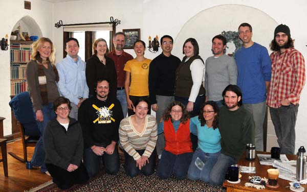
History/Geography 932 Seminar, Fall 2008
(click for larger image)
From Left to Right:
Rear: Liese Dart, Brian Hamilton, Abigail Popp, Bill Cronon, Emma Schroeder,
Po-Yi Hung, Jacquelyn Gill, Stillman Wagstaff, Stephen Laubach, Brien Barrett
Front: Cathy DeShano, Jesse Gant, Genya Erling, Michelle Niemann, Trish O'Kane, Kevin Gibbons
(Photo by Nan Fey, 2008)
Here are the members of the History/Geography 932 seminar and the pages they helped author. Everyone contributed to the Landscapes page, and everyone participated in virtually every phase of the brainstorming, designing, editing, revising, beta-reviewing process. I want to thank everyone involved for the extraordinary effort and positive energy that they poured into this site.
Brien Barrett, History: Searching, Maps
Liese Dart, Environment & Resources: Positioning, Government Documents
Cathy DeShano, Journalism & Mass Communications: Note-taking, Interviews
Genya Erling, Environment & Resources: Writing, Maps
Jesse Gant, History: Documents, Manuscripts
Kevin Gibbons, Conservation Biology & Sustainable Development: Searching, Interviews (and webpage template)
Jacquelyn Gill, Geography: Argument/Narrative, Quantitative
Brian Hamilton, History: Positioning, Manuscripts
Po-Yi Hung, Geography: Research Questions, Images
Stephen Laubach, Curriculum & Instruction, Science Education: Argument/Narrative, Images
Michelle Niemann, English: Searching, Periodicals
Trish O'Kane, Environment & Resources: Writing, Interviews
Abigail Popp, Geography: Research Questions, Quantitative
Emma Schroeder, Geography: Note-taking, Government Documents
Stillman Wagstaff, English: Documents, Periodicals
Return to Top of Page
| 
